




Freelance Graphic Designer
For your ads, print, and website, all in one look
As a freelance graphic designer, I design ads, logos, print pieces, and websites for small businesses, from the idea and the headline to the finished design, and I make them work together. Since 2021 I’ve designed more than 140 ads for magazines, newspapers, billboards, and screens. Your ad, your billboard, your pricing guide, and your homepage share the same colors, the same type, and the same voice, and every design request goes to one person who already knows your brand.


Ads that look like the business behind them
More than 140 ads since 2021, for print, screens, and the roadside.
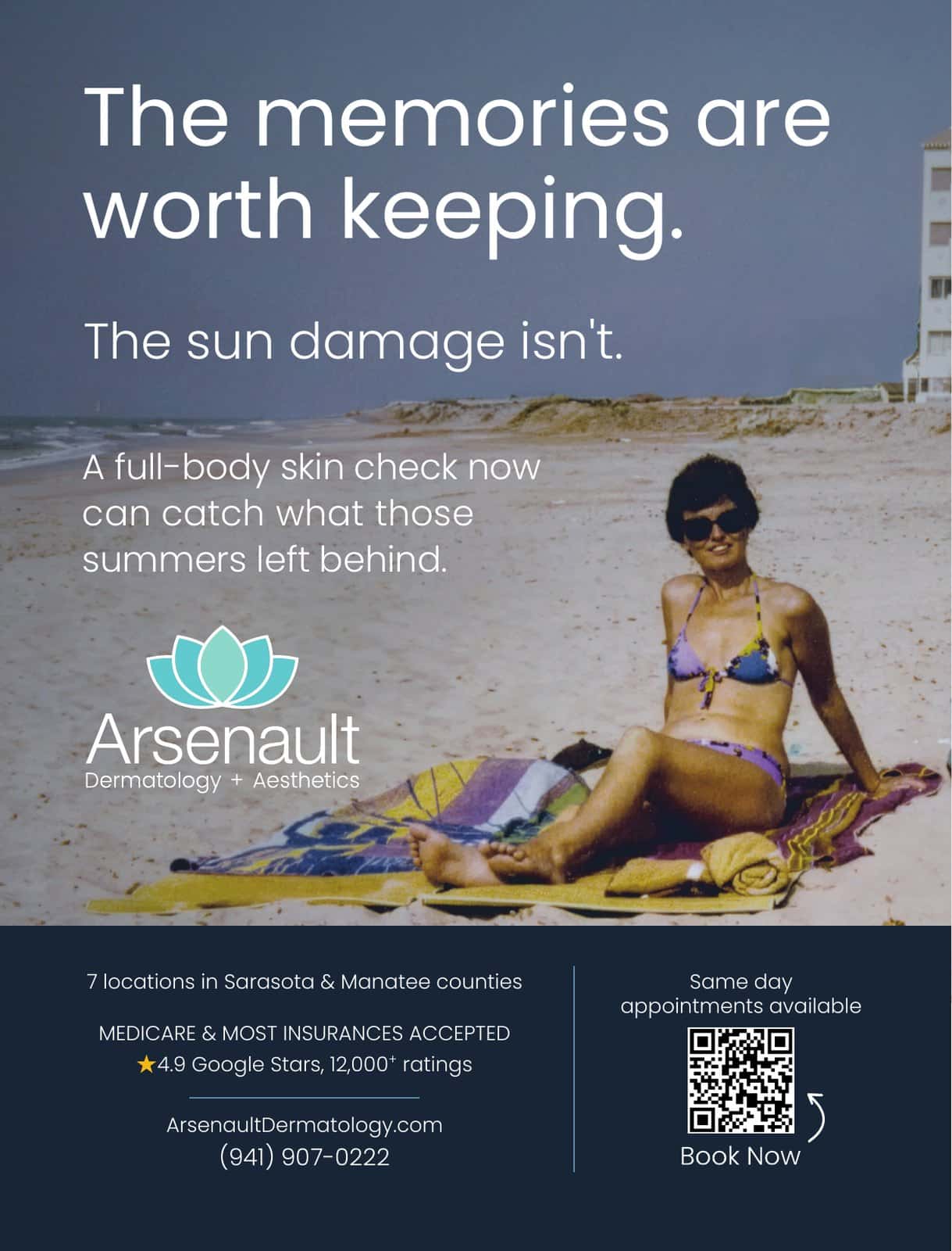
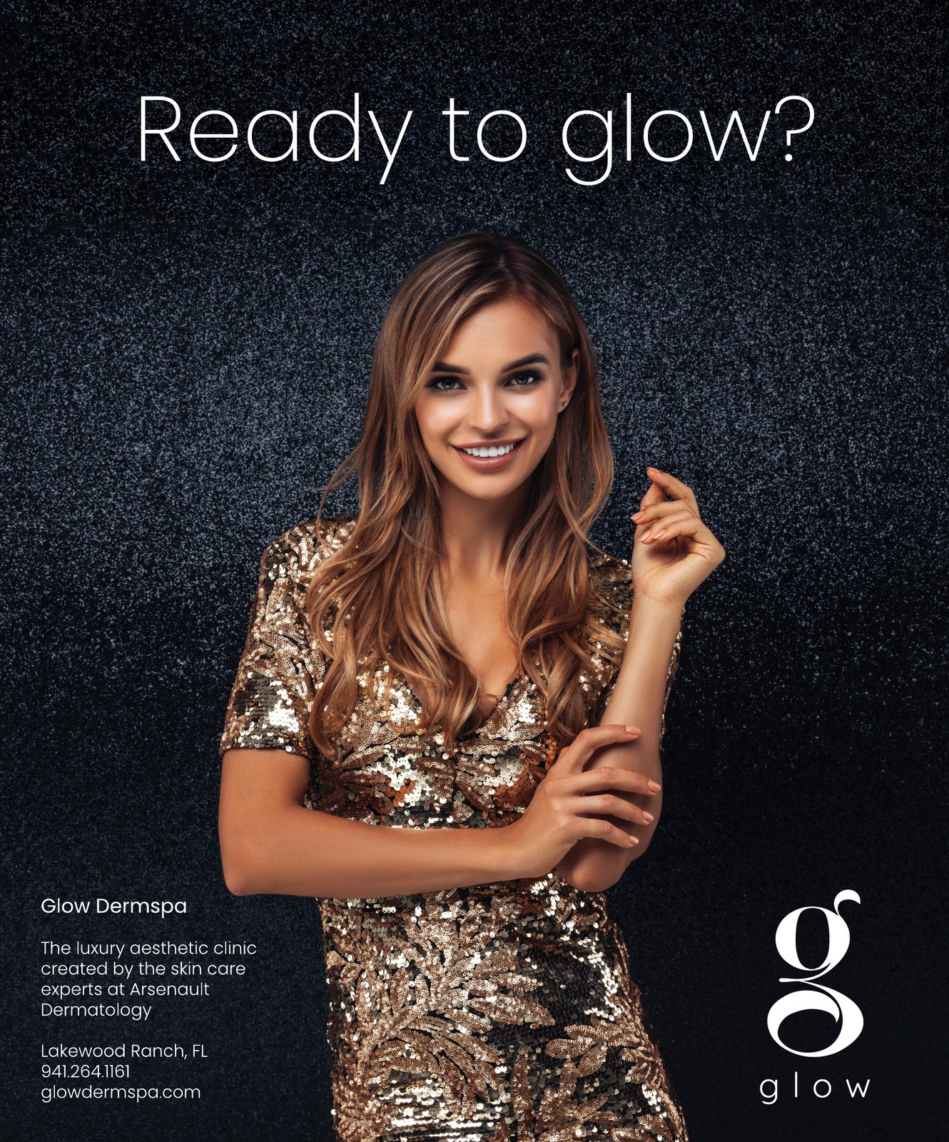
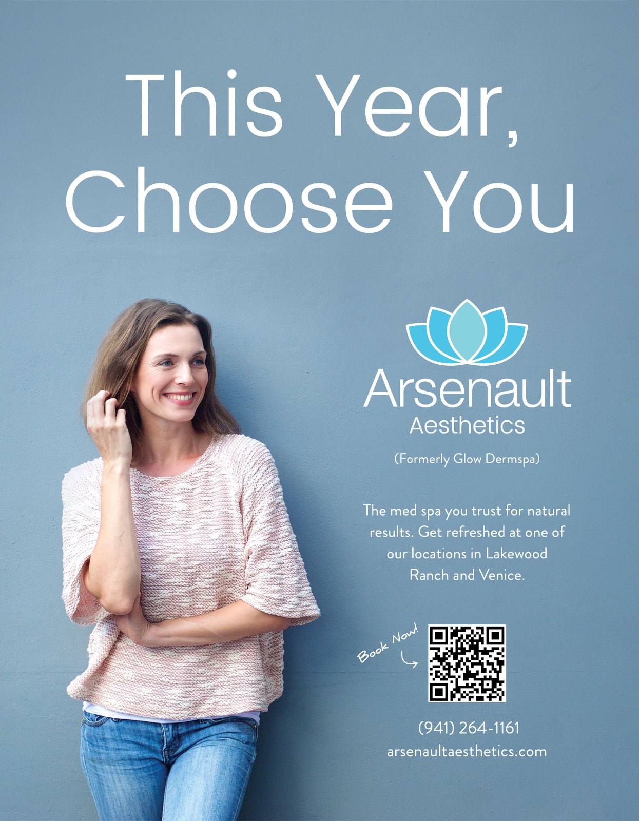
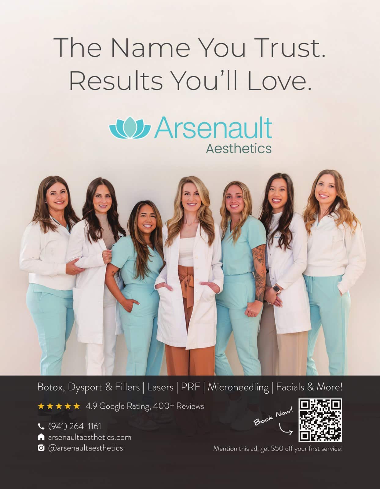
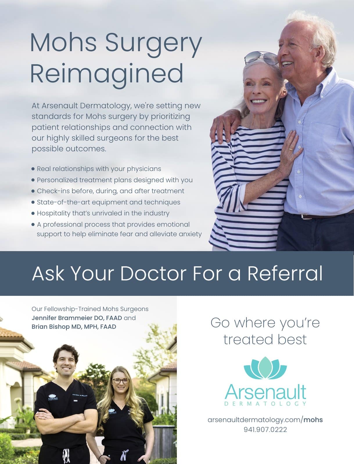
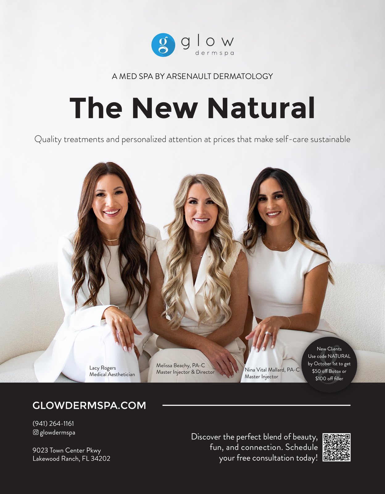
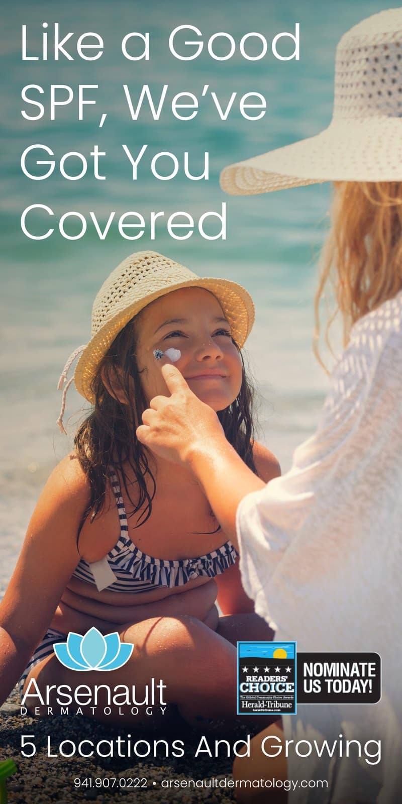
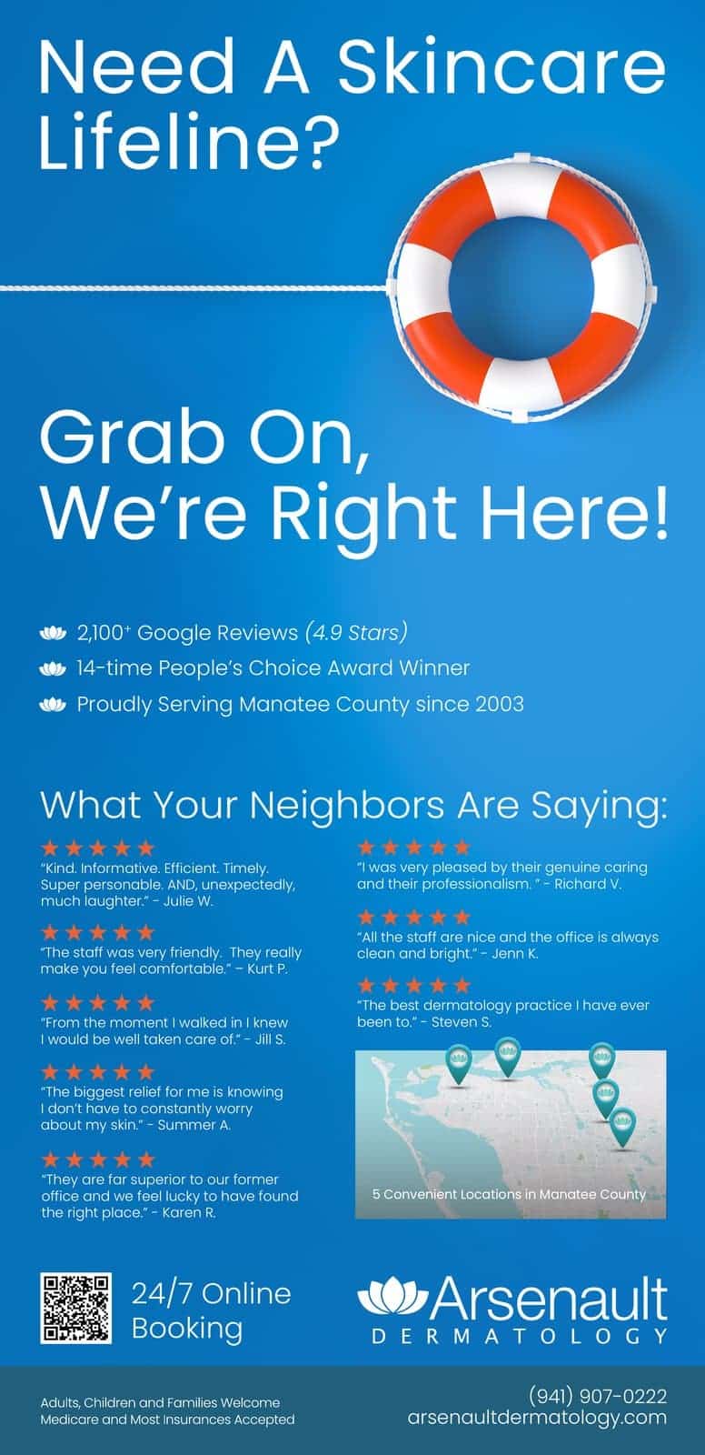
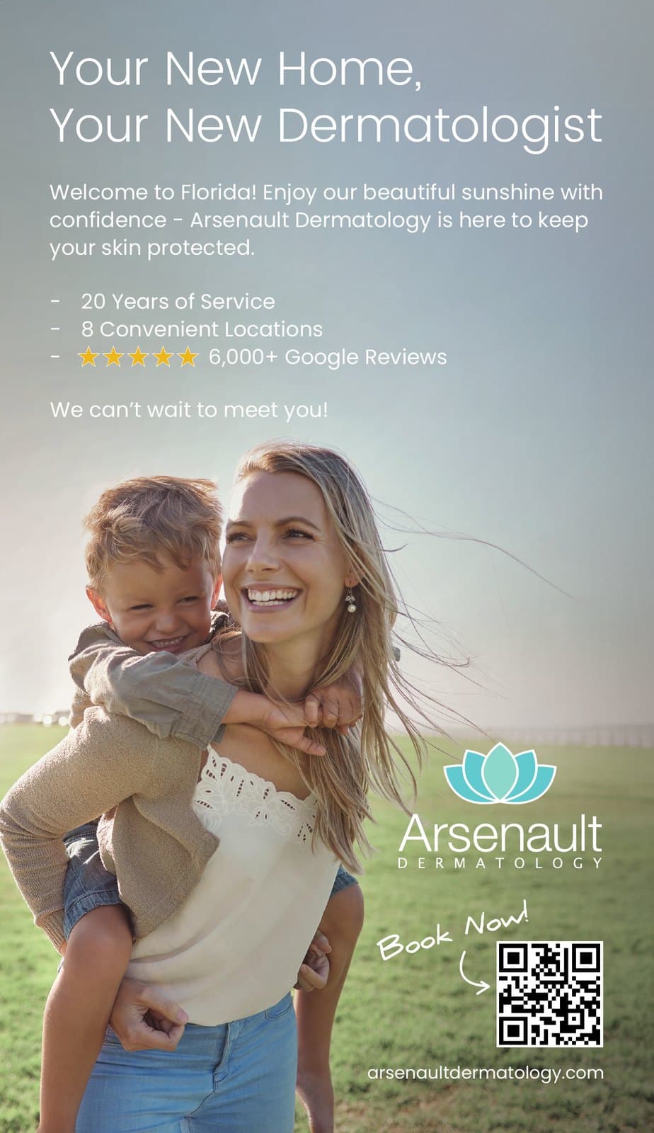
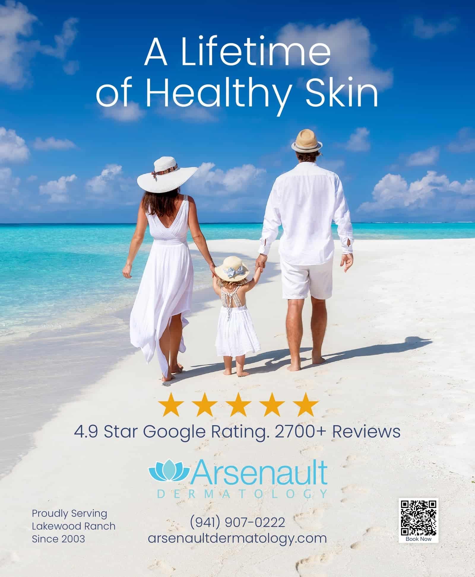
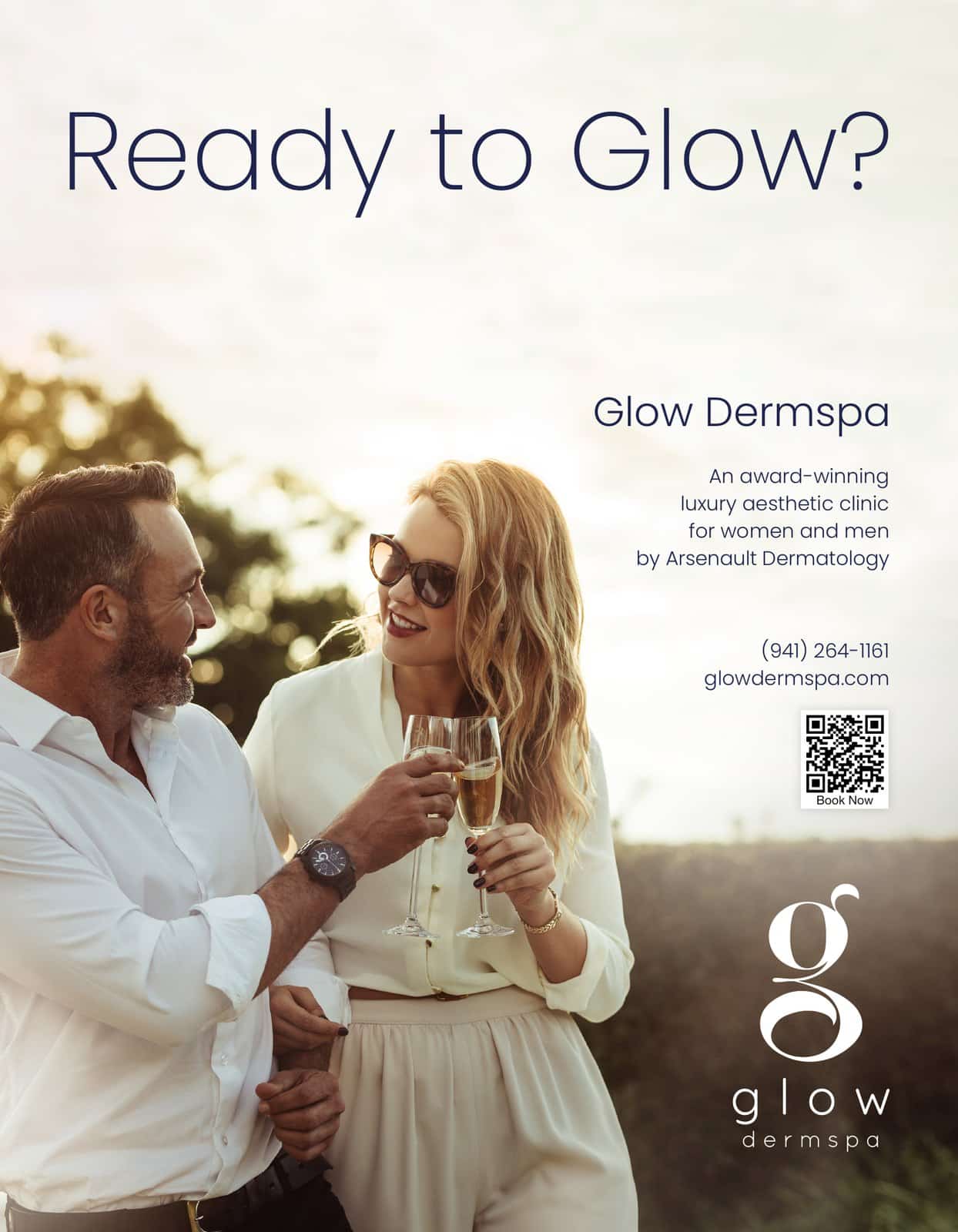
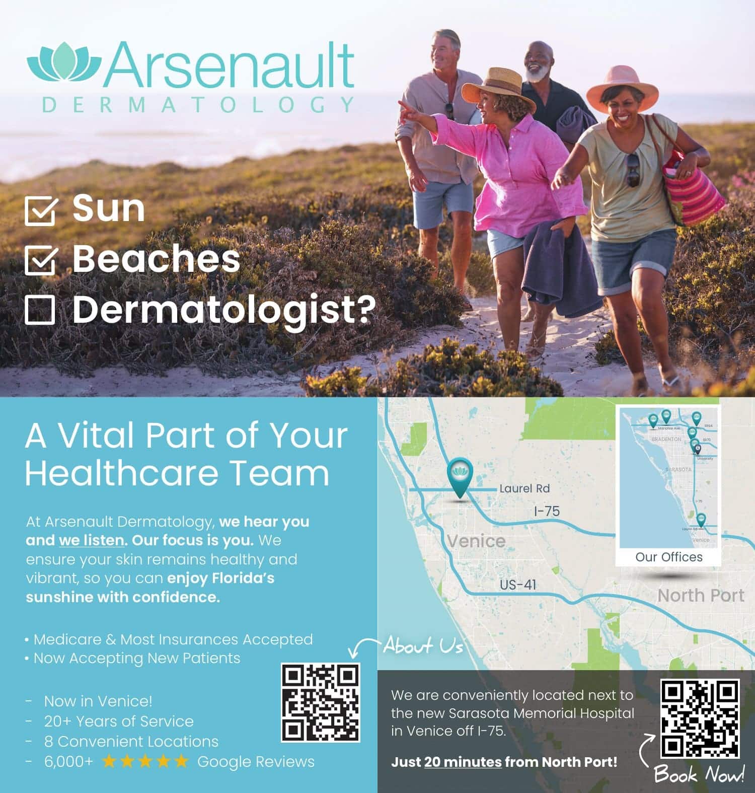
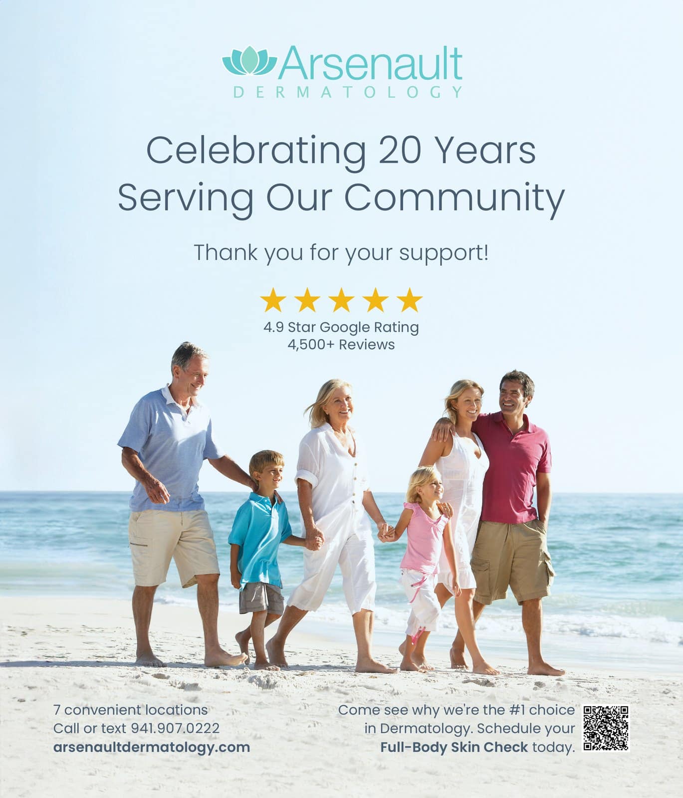
Most of the ads on this page were designed for one client, Arsenault Dermatology, a dermatology practice with offices across Sarasota and Manatee counties, and its med spa, which opened as Glow Dermspa and is now Arsenault Aesthetics. I design and look after their websites too, so every ad starts from the photos, colors, and voice their customers already know from the site.
Since 2021 I’ve designed more than 140 ads for them, about one every two weeks. They’ve run in magazines, newspapers, theater programs, and school sponsorships, and on billboards and screens, in more than 35 places in all. On many of them I also came up with the idea and wrote the words.
These are a few of my favorites. Click any ad to see it full size.


One photo, one idea, room to breathe
Simple, clear, and bright, because an ad gets a second or two.
Meet people where they are.
Most people aren't looking at ads. They're turning a page, driving to work, or scrolling on their phone, and an ad gets a second or two of their attention, if it gets any. In that second, a crowded ad loses. People are drawn to what is clear and striking, and they skip anything that looks like work to read.
"Simplicity, simplicity, simplicity!"
Henry David Thoreau
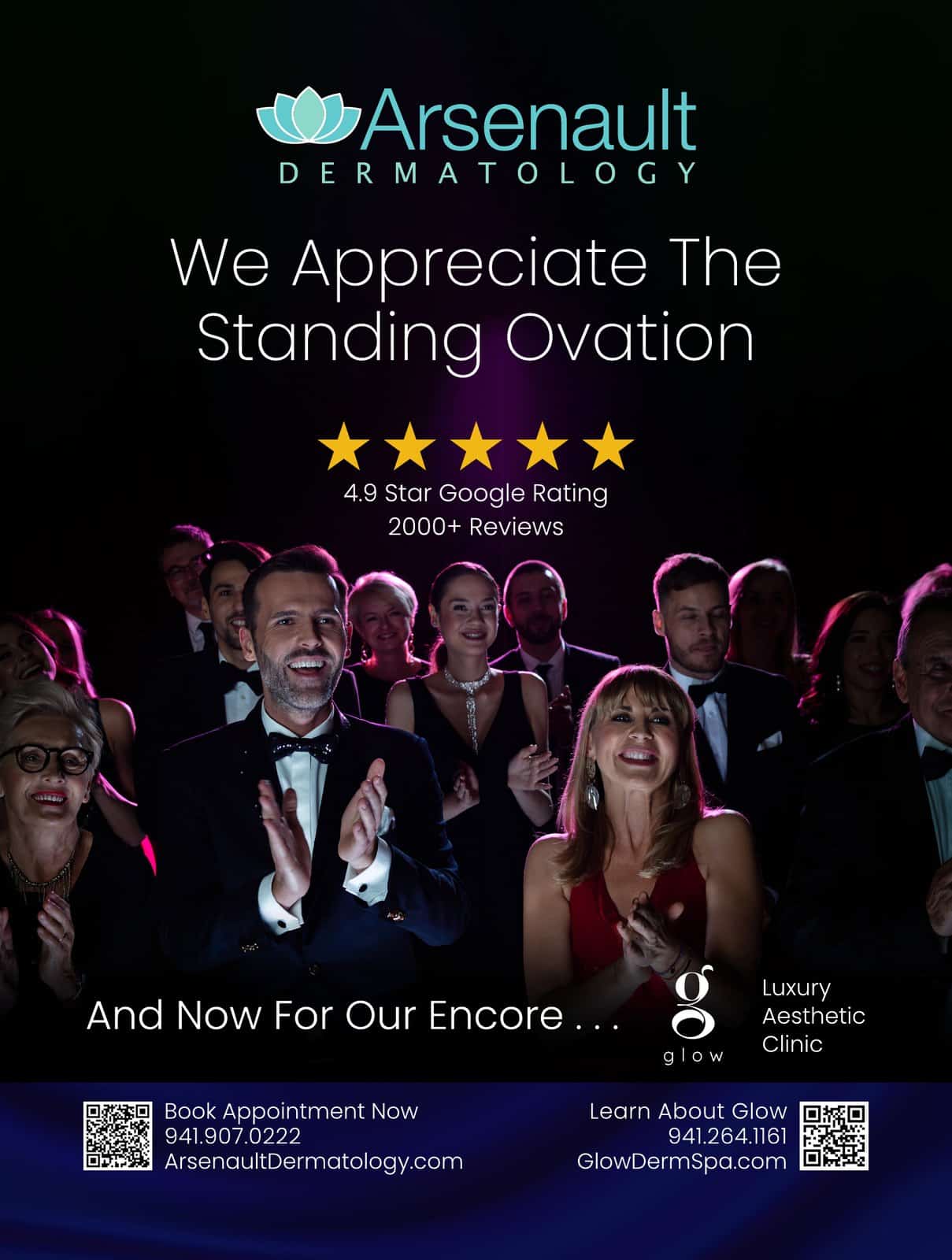
Most of my ads come down to one strong photograph, one clear headline, and the logo, with plenty of open space around them. I look for photos with negative space, a stretch of sky or sea or a plain wall, so the headline has somewhere to sit. The type is large but light, and nothing on the page competes for attention. The reviews, the phone number, and how to book sit together in one tidy block, so the next step is easy to find.
1One headline, large and light12Open space, so the words can breathe23One photo, one person34The logo, with room of its own45How to book, small and together5- 1One headline, large and light
- 2Open space, so the words can breathe
- 3One photo, one person
- 4The logo, with room of its own
- 5How to book, small and together
Clarity over clutter
It's the same thinking behind the websites I build. Decide what matters most, make it the first thing people see, and take away whatever gets in its way. A homepage, a billboard, and a magazine page all work better when each one has a single job to do.
Start with something people already know
The fastest way to get someone to stop is to show them something they already recognize, like a famous movie poster or a line from the moon landing. People get it in a second, and then they read the rest. The two ads below show how that works.
Two ads, and the ideas behind them
Each one borrows something its audience already knew.
A good ad starts with an idea that fits where it will run and who will see it there. These two show how that works.

Opening night
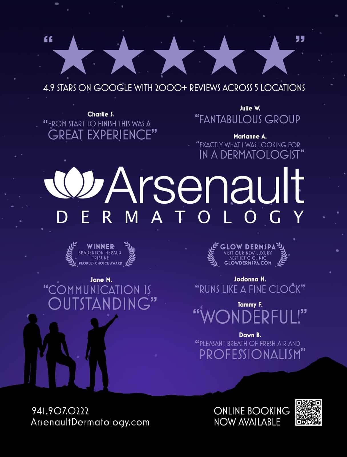
This ad ran in the opening night program at the Asolo Rep, a theater in Sarasota, Florida, so the people reading it were already in their seats, waiting for the curtain to go up.
The idea came from the poster for La La Land, a movie most of that audience knew well. It has a purple night sky full of stars, figures in silhouette on a hill, and real five-star patient reviews set out the way a movie poster quotes the critics. It reads like part of the evening, and it still tells people where to book.

One giant leap
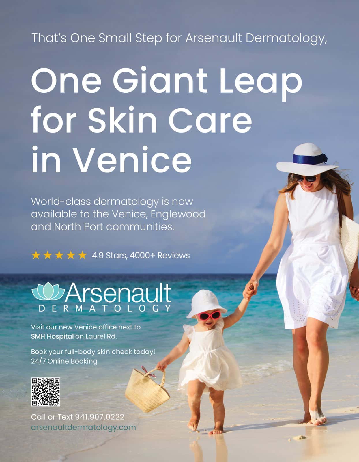
This ad announced the practice's first office in Venice with a line nearly everyone knows. The small step is a new office. The giant leap is skilled dermatology close to home for Venice, Englewood, and North Port.
Many people in Venice watched the moon landing when they were young and still remember that night, so the line carried a warm, familiar feeling for exactly the people the new office needed to reach.

A different design for every place an ad runs
Magazines, newspapers, billboards, and screens each get their own.
Each kind of ad is read differently. A magazine reader, a driver, and someone scrolling on a phone each give an ad a different amount of time, so each kind is designed for the way it will be seen.
Magazine ads
Full pages and spreads in regional and lifestyle magazines.
Digital campaigns
Display ad sets for Google, Facebook, and news websites.
Newspaper ads
Full pages, half pages, and campaigns in local papers.
School sponsorships
Field banners, car-line banners, and ads in school magazines.
Theater and arts programs
Full pages in theater, opera, and orchestra programs.
Guides and directories
Newcomers guides, physician guides, and best-of directories.
Billboards
Printed and digital boards, read in a few seconds from the road.
Direct mail
Postcards for openings, new offices, and events.
Along with the ads, I design the print a business uses every day, like signs, flyers, rack cards, and handouts.
Print design: billboards, magazine and newspaper ads, and pricing guides
A billboard, an ad, and a pricing guide are each read in a different way.
I design print pieces for many of the businesses whose websites I build. Print has limits a screen doesn’t, like a few seconds at highway speed, a fixed size on a magazine page, ink on thin paper. Each kind of piece has its own rules, and the design follows them.


Billboards
One idea, a few big words, strong contrast, and your logo. Drivers get a few seconds, so anything that doesn't read at a glance comes off.


Magazine and newspaper
Built to each publication's spec sheet, so the ad goes in right the first time. A magazine can carry a big photo, while a newspaper needs bolder type.
Pricing guides
Your services and packages, laid out to match your website. For Love and Beauty Maui, the guide set the style the new site followed.

Have a print piece in mind?
Send the detailsBillboards built for a glance
One idea, a few big words, and a logo you can spot from the road.
Arsenault Dermatology has billboards on the main roads into Venice and Bradenton. Each one carries a single message in large type, with strong contrast and the logo where the eye lands.
When a board fades or the message changes, I redesign it and build the file to the billboard company’s specs.
Right: Bradenton, 2025. A 10 x 40 foot bulletin.
Left: Venice, 2026. The same layout with a second message.
"Our goal is always to have a 'national level' presence in our visual marketing. I think we've achieved that."
Digital ads, rebuilt for every size
One design, laid out again for each space an ad network sells.
A display campaign runs in five or more sizes at once, like a wide banner across the top of a page, a square beside an article, a tall skyscraper, and a thin strip on a phone. Each size gets its own layout instead of a shrunken copy, so the logo and the message still read at 320 pixels wide.
I’ve built more than 20 digital campaigns this way, for Google display ads, Facebook, newspaper websites, and a magazine’s online ad network. Here are two, shown the way readers saw them, on a news site and on a phone.


Our Focus Is YouArsenault Dermatology, Google display ads, 2023. Five sizes from one design.





Celebrating 20 YearsArsenault Dermatology, Google display ads, 2023. Five sizes from one design.
From a 1970s snapshot to a skin check ad
A real snapshot, edited to make room for the message.
This Sarasota Magazine ad needed a photo of the summers people remember, since a skin check today can catch what those summers left behind. I found a real 1970s beach snapshot with the right woman in it, and then changed nearly everything around her.
I took out the other beachgoers, the umbrellas, and most of the hotel, opened up the ocean behind her, and moved her to the right to make room for the headline. The faded color stayed, so the photo still looks like it came out of a family album.

Every ad starts with a logo that holds up.
Small or large, in color or in one color, a logo should still read.
Your logo shows up in more places than any other piece of design you own, like the top of your website, the tab in a browser, your social media profiles, your invoices, your truck, your sign, and maybe a billboard. A good logo works in every one of them.
Every ad, sign, and print piece depends on it. Whoever designs your logo, look for these five qualities:
I draw every logo as a vector file. A vector file describes the logo as outlines and fills, so it can be printed at any size, from a browser tab to the side of a building, and the edges stay sharp.
Most of my logo work happens inside a website project, where the logo and the site are planned as one job. The Logo design page walks through how a logo project runs and shows the full gallery.
Need a logo with your site?
Tell me about it"Josh has been great to work with. When I needed help designing a logo for my jewelry business, he was very quick to sense the 'look' I was after. He took my rather vague directions and turned them into a design that is uniquely mine."
Designed with your website
When every piece matches, every piece builds trust.
Customers rarely meet your business in one place. They pass the billboard on the drive home, look you up on their phone that night, and read your pricing guide before they get in touch. If each piece looks like it came from a different company, each one costs you a little trust. When they all match, every piece reminds the customer who you are.
Same look, everywhere
When I design a print piece for a business whose website I built, I start from what's already there, like the colors, the fonts, the logo files, the photos, and the way your site talks.
The words, too
I often write the headline and the copy as well, in the same voice as your homepage. You explain your business once, and every piece after that starts from what I already know.
Ads that point somewhere
An ad or a billboard can send people to a page built for that one offer, through a short web address or a QR code. The visits to that page show which ads bring people in.
Print pieces, and the logos they carry
Logos and a pricing guide from real client projects.
These logos and print pieces come from client projects.


Love and Beauty Maui
The pricing guide for a wedding hair and makeup studio, in the same style as its website.
"I'd like to introduce you to our designer extraordinaire, Josh Miller. Josh's work is flawless."
Questions about graphic design
Still have a question?
Ask me directlyWhat does a freelance graphic designer do?
A freelance graphic designer is an independent designer who creates a business's logo, colors, and type, and the ads, signs, and printed pieces built from them, working with clients directly. I also design and build websites, so your print work and your website come from the same person. Since 2021, I've designed more than 140 ads for magazines, newspapers, billboards, and screens.
Should I hire a freelance graphic designer or an agency?
A freelance graphic designer is usually the better choice for a small business, because you work directly with the person designing your pieces, and they know your brand from one job to the next. With me, every design request goes to the person who knows your logo, colors, photos, and voice, and often built your website too. There are no account managers in between, and nothing has to be explained twice.
How do I hire a freelance graphic designer?
To hire a freelance graphic designer, look at work they've done for businesses like yours, check that their pieces match each client's website and brand, and ask who writes the words and how files reach the printer. Then send a clear request with what you need, where it will run, the sizes, and any deadline. You can see my ads, logos, and print pieces on this page, and every request comes to me.
What makes a good billboard design?
A good billboard design has one idea, a few large words, strong contrast, and a logo the eye finds right away, because drivers read it in a few seconds at highway speed. Anything that doesn't read at a glance comes off, and many designers aim for about seven words or fewer. I've designed printed and digital billboards on the main roads into Venice and Bradenton, Florida, and I build each file to the billboard company's specs.
What size is a billboard design?
A standard billboard bulletin is 14 by 48 feet, and a standard poster board is about 10 by 23 feet, though sizes vary from one billboard company to the next. Digital boards have their own pixel sizes. That's why every billboard design starts from the company's spec sheet, which lists the exact size and file requirements. One of my Bradenton boards is a 10 by 40 foot bulletin.
How much does a freelance graphic designer charge?
What a freelance graphic designer charges depends on the piece. It comes down to how many sizes and versions it needs, whether it starts from an existing logo, and how much writing it calls for. A single ad costs less than a campaign in five sizes, and a billboard built from your existing brand costs less than one that needs a new logo first. We talk through the cost on our call, and I aim for the right blend of price and quality.
Why use the same designer for my website and my print work?
Using the same designer for your website and your print work makes every piece look like the same business. When one designer handles both, the colors, fonts, photos, and wording carry over without files and instructions passing between people. It also saves you time. A new ad or guide starts from the work already done on your site, so there's less to explain and less to approve.
What kinds of print pieces do you design?
I design billboards, magazine and newspaper ads, pricing guides, signs, flyers, rack cards, and handouts, along with the other printed pieces a business uses every day. Each file is set up to the printer's or the publication's requirements, so it prints the way it was designed. If you need a logo first, the Logo design page shows how a logo project runs.
Do you design digital ads?
Yes, I design digital ads, including display ads for Google, Facebook, and newspaper and magazine websites. A campaign usually needs five or more sizes, and each one gets its own layout so the message reads at every size, down to 320 pixels wide on a phone. Send me the list of sizes your ad network or publisher wants, and you get each one ready to upload.
Do you write the ad copy too?
Yes, I often write the ad copy too. On many of my ads I came up with the idea and wrote the headline and the copy as well as designing the page. If you already have the words, I design around them. If you don't, I write them in the same voice as your website, and you approve them before anything goes to print.
Can you tell whether a print ad is working?
Yes, you can tell whether a print ad is working when it sends people online. I add a QR code or a short web address that leads to a page made for that ad, and each visit shows up in Google Analytics, so you can see which ads bring people in.
I've booked an ad in a magazine. What do you need from me?
For a magazine ad, I need the publication's spec sheet, which lists the ad's size and file requirements, and the date the file is due. Then tell me the message, meaning what you're offering, who it's for, and what you want readers to do. Add any photos you'd like to use and your logo files, unless I already have them from your website. If the deadline is close, say so in the form, and the schedule is set around it.
Do you handle the printing?
I don't handle the printing itself, but I build each file to the publication's or the printer's specs and can send it straight to your ad rep or your printer. You place and pay for the ad or the print order yourself, and the file arrives ready to print.
What is your design style?
My design style is simple, clear, and bright. Most of my ads come down to one strong photograph, one clear headline, and the logo, with plenty of open space around them. People give an ad a second or two, so it has to read at a glance. My style explains why.
Make every piece look like your business.
Tell me what you need designed, whether a logo, an ad, a billboard, a pricing guide, or a website to go with them. Include any deadline and your web address if you have one. I read each request myself and reply to set up a short call. If we’re a good fit, I’ll walk you through how we get started. From there, I design the piece, and we work on it together until it’s right. Send it through the form.