




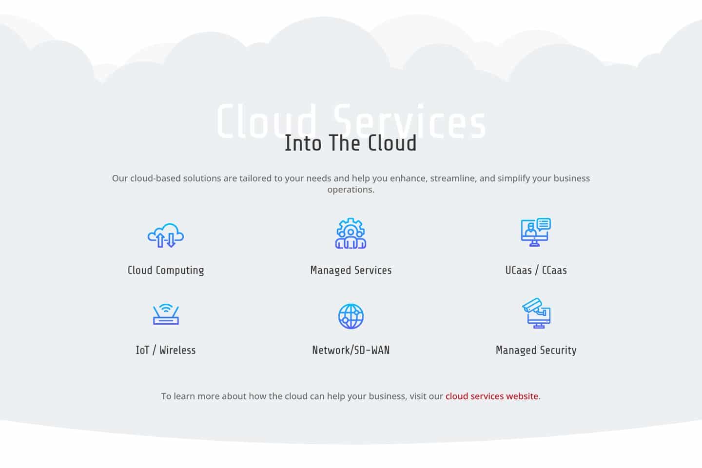
The cloud services homepage. Navy, white, and red, with the cloud drawn as a place your business can work from.

The work came in three parts, a year or so apart, and each one built on the last:

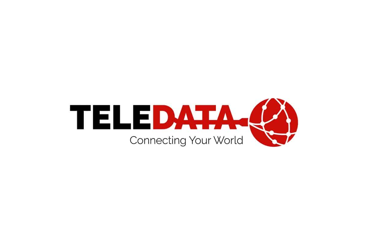
The logo, 2018
The company's first new mark under the new owners, needed for vans, the building sign, shirts, and invoices.

The company website, 2018
A new site for Teledata that said who the company was, what it did, and who did the work.

The cloud services website, 2020
A separate site for Teledata Cloud Services, a new business the owners started to sell cloud services nationally.


The company website: modern and friendly
For the company site, Micah asked for a site that was "clean, organized, simple, informational, helpful, modern," and, in his words, "JAZZ HANDS." The owners wanted a technical company to look current and still feel friendly, and they wanted people to see that Teledata was a good place to work. So the site gave the crew a page of its own, with a photo of each person. It explained each service in plain words and kept the customers' favorite feature from the old site, a link to put in a service request.


The cloud services website: built to feel like the cloud
In 2020, the owners started Teledata Cloud Services as a separate business. Cloud services are a different kind of work from cabling. They can be sold across the country, and they need a lot of explaining. The cabling stayed on the main site, and the cloud business got a site of its own.


Built to drift like the cloud
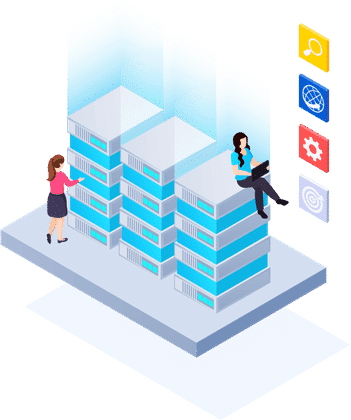
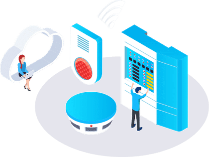
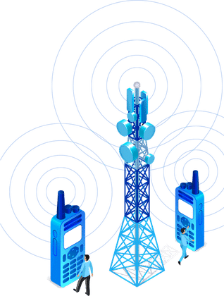
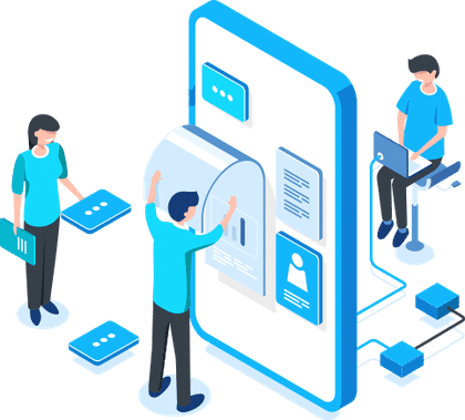
I wanted that site to feel like the cloud. The pages are navy, like a night sky, and each one rests on a band of soft white clouds. Illustrations of servers, devices, and people working float above them, and the graphics move up and down as you scroll, so the page seems to drift. The red from the logo carries the headlines and the buttons, so the two businesses look related at a glance.
Plain words for a hard subject
The words had to make a hard subject simple. The site's promise is "The Cloud Simplified," and every page follows it. Each service, from cloud computing to managed security, gets a page that says what it is and what it solves. Pages for each industry, from manufacturing to hospitality, show what the cloud does for a business like the reader's. A button to schedule a consultation sits on every page.

A first inquiry in three days
3 daysFrom launch to the first customer inquiryThe company site went live on December 28, 2018. Three days later, on December 31, the first message from a business looking for help came in through its contact form, and I passed it along to make sure the team had it.








A picture for every service
80+Illustrations on the cloud siteThe cloud site carries more than 80 illustrations, one or more on every service and industry page, from servers in a cloud to a hotel lobby. Each one shows what the page is about, so a reader who isn’t sure what the cloud is can see it before reading a word.


The crew, front and center
20+People on the team page todayThe team page gave every person a photo and a few lines in their own words about how they came to Teledata, what they think of it, and a fun fact. It started with the crew in 2018, the office dog included. Today it holds more than 20 people, and Teledata’s own team keeps it up.

Five rounds, then one logo
5 roundsLogo concepts in three days, then a yesThe logo questionnaire came in on March 12, 2018. The first concept went over on March 26, and two days and five rounds later the owners approved it. The same mark now runs on the crew’s vans and shirts, and on both websites.
"Our website depicts that culture as well as clearly defines what we do."
"My son and I purchased a small company in 2018 and Josh helped us rebrand with a new logo and website. Josh took the time to understand what we do which helped him create our new logo first, and then our website. He has a great mix of technical and creative skills. We are attempting to foster a different culture within our company and our website depicts that culture as well as clearly defines what we do. We have been really pleased with his work, good work Josh!"

Logo Design
A new mark for the new owners, with a hidden message and versions for shirts and the cloud business.

Company website, 2018
A site for the cabling and phone business, with the team, the services, and a service request link.

Cloud services website, 2020
A separate site for a new business, with scrolling and motion effects and a page for every service.
Copywriting
Plain words for technical services on both sites, from data cabling to cloud computing.

Looking back
Telecommunications isn't known for being exciting, and that's exactly what made Teledata such a fun challenge. How do you make phone systems and data cabling look interesting? Wes and Micah had also built a culture at the company they were proud of, and they wanted the website to lead the way in showing it.
I started with the logo. My favorite logos have always carried a hidden message, like the arrow tucked into the FedEx lettering, so I built one into Teledata's, a cable that runs through the name and plugs into the world. It's there for anyone who looks closely. From there, phone cords and data cables became part of the design itself.
The cloud services site called for a different approach. The cloud is a hard idea to grasp, so I made it the most graphics-driven site I've ever built, with every line of text written to work alongside the pictures.
Two businesses under one name needed two very different solutions, and finding the right one for each was the best part of the project.

Love and Beauty Maui
A wedding hair and makeup studio on Maui, and what a new website did for its inquiries.
Read the case study
Medrock Pharmacy
A pharmacy's logo and website, built to grow from one location to three.
Read the case study
Ecosense
A decontamination company's logo and website, and a working relationship that started in 2015.
Read the case study